Побудова графіків
Останнє оновлення 2026-06-18 | Редагувати цю сторінку
Приблизний час: 30 хвилин
Огляд
Питання
- Як побудувати графік за моїми даними?
- Як зберегти графік для публікації?
Цілі
- Створення графіку часового ряду, який відповідає одному набору даних.
- Створення точкової діаграми, або діаграми розсіювання, яка показує зв’язок між двома наборами даних.
matplotlib є
найпоширенішою науковою бібліотекою для візуалізації даних в
Python.
- Зазвичай використовується його частина - бібліотека
matplotlib.pyplot. - За замовчуванням Jupyter Notebook відображає графіки безпосередньо в блокноті.
- Створення простих графіків є (відносно) нескладним.
PYTHON
time = [0, 1, 2, 3]
position = [0, 100, 200, 300]

plt.plot(time, position)
plt.xlabel('Time (hr)')
plt.ylabel('Position (km)')
Зображення всіх графіків з програмного коду
У прикладі з Jupyter Notebook виконання комірки призводить до побудови графіку безпосередньо під кодом. Графік також зберігається у блокноті для подальшого перегляду. Проте, інші середовища Python, такі як інтерактивна сесія Python, що виконується у терміналі, або Python скрипт, виконаний за допомогою командного рядка, потребують додаткової команди для зображення графіку.
Доручіть matplotlib зобразити графік:
Цю команду також можна використати в блокноті - наприклад, для зображення декількох графіків одночасно, якщо відповідний командний код міститься в одній комірці.
Побудова графіків безпосередньо з датафреймів Pandas.
- Для побудови графіків можна також використовувати датафрейми Pandas.
- Перед побудовою графіку ми перетворюємо назви стовпців із типу
stringнаinteger, оскільки вони представляють числові значення. Для цього використовуємо метод str.replace(), щоб видалити префіксgpdPercap_, а потім astype(int), щоб перетворити ряд значень рядка (['1952', '1957', ...'2007']) у ряд цілих чисел:[1925, 1957, ..., 2007].
PYTHON
import pandas as pd

data = pd.read_csv('data/gapminder_gdp_oceania.csv', index_col='country')

# Extract year from last 4 characters of each column name
# The current column names are structured as 'gdpPercap_(year)',
# so we want to keep the (year) part only for clarity when plotting GDP vs. years
# To do this we use replace(), which removes from the string the characters stated in the argument
# This method works on strings, so we use replace() from Pandas Series.str vectorized string functions

years = data.columns.str.replace('gdpPercap_', '')

# Convert year values to integers, saving results back to dataframe

data.columns = years.astype(int)

data.loc['Australia'].plot()
Виділіть та трансформуйте дані, а потім побудуйте графік.
- За замовчуванням,
DataFrame.plotзображує рядки на осі X. - Ми можемо транспонувати дані, щоб побудувати кілька графіків разом.

Доступні багато стилів графіків.
- Наприклад, можна створити стовпчикову діаграму з більш вишуканим стилем.

Графік також можна побудувати, викликавши безпосередньо функцію
plot бібліотеки matplotlib.
- Формат команди є таким:
plt.plot(x, y) - Колір та формат маркерів також можна вказати як додатковий
необов’язковий аргумент, тобто,
b-- це синя лінія,g--- це зелена пунктирна лінія.
Отримаємо дані Австралії з датафрейму.
PYTHON
years = data.columns
gdp_australia = data.loc['Australia']

plt.plot(years, gdp_australia, 'g--')
Можна побудувати кілька графіків за різними наборами даних одночасно.
PYTHON
# Select two countries' worth of data.
gdp_australia = data.loc['Australia']
gdp_nz = data.loc['New Zealand']

# Plot with differently-colored markers.
plt.plot(years, gdp_australia, 'b-', label='Australia')
plt.plot(years, gdp_nz, 'g-', label='New Zealand')

# Create legend.
plt.legend(loc='upper left')
plt.xlabel('Year')
plt.ylabel('GDP per capita ($)')Додавання легенди
Зазвичай при побудові графіків з кількох наборів даних разом, бажано мати легенду, що описує ці дані.
Це можна зробити в matplotlib за два етапи:
- Вкажіть мітку для кожного набору даних у графіку:
PYTHON
plt.plot(years, gdp_australia, label='Australia')
plt.plot(years, gdp_nz, label='New Zealand')- Доручіть
matplotlibстворити легенду.
За замовчуванням matplotlib спробує розмістити легенду у відповідному
місці. Якщо необхідно вказати конкретне розташування, можна застосувати
аргументи функції loc=, наприклад, щоб розмістити легенду в
лівому верхньому куті графіку, задайте loc='upper left'

- Побудуйте точкову діаграму співвідношення ВВП Австралії та Нової Зеландії
- Використовуйте
plt.scatterабоDataFrame.plot.scatter


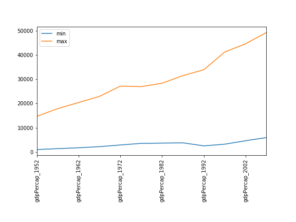
Мінімуми та максимуми
Заповніть порожні поля нижче, щоб побудувати графік мінімального ВВП на душу населення протягом часу для всіх країн Європи. Потім побудуйте графік максимального ВВП на душу населення в Європі.
Співвідношення
Модифікуйте приклад у примітках, щоб створити діаграму розсіювання, що показує співвідношення між мінімальним і максимальним ВВП на душу населення серед країн Азії за кожен рік у наборі даних. Який зв’язок ви бачите (якщо такий є)?
PYTHON
data_asia = pd.read_csv('data/gapminder_gdp_asia.csv', index_col='country')
data_asia.describe().T.plot(kind='scatter', x='min', y='max')
Між мінімальним і максимальним значеннями ВВП за роками не спостерігається чіткої залежності. Здається, статки азійських країн не зростають і не падають разом.
Співвідношення (continued)
Ви можете помітити, що варіабельність максимальних значень значно вища, ніж варіабельність мінімальних значень. Зверніть увагу на максимальні значення та відповідні індекси:
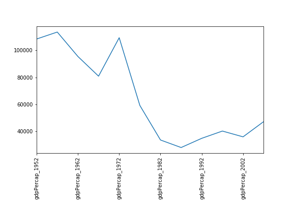
Здається, варіабельність цього значення зумовлена різким спадом після 1972 року. Можливо, тут зіграли роль геополітичні чинники? Враховуючи домінування нафтовидобувних країн, можливо, індекс нафти Brent стане цікавим об’єктом для порівняння? У той час як М’янма постійно має найнижчий ВВП, країна з найвищим ВВП змінюється більш помітно.
Більше кореляцій
Ця коротка програма створює графік, який ілюструє взаємозв’язок між ВВП і очікуваною тривалістю життя на 2007 рік, змінюючи розмір маркера в залежності із чисельністю населення:
PYTHON
data_all = pd.read_csv('data/gapminder_all.csv', index_col='country')
data_all.plot(kind='scatter', x='gdpPercap_2007', y='lifeExp_2007',
              s=data_all['pop_2007']/1e6)
Використовуючи онлайн-довідку та інші ресурси, поясніть роль кожного аргументу, який передається у функцію plot.

Гарне місце для пошуку документації до функції plot - help(data_all.plot).
kind - Як вже було показано, цей параметр визначає тип графіку, який буде створено.
x та y - імена стовпців або індекси, що визначають, які дані будуть розміщені на графіку на осях x та y
s - Інформацію про цей аргумент можна знайти в документації plt.scatter. Це одне число або одне значення для кожної точки даних. Визначає розмір маркера.
Збереження вашого графіка в файл
Якщо вас влаштовує побудований графік, можливо, ви захочете зберегти його у файл — наприклад, для включення у публікацію. У модулі matplotlib.pyplot є функція, яка виконує це: savefig. Виклик цієї функції
збереже поточний графік у файл my_figure.png. Формат
файлу буде автоматично визначено з розширення імені файлу (інші формати:
pdf, ps, eps і svg).
Зауважимо, що функції в plt посилаються на глобальну
змінну графіка і після того, як графік виведено на екран (наприклад, за
допомогою plt.show) matplotlib змусить цю змінну посилатися
на новий порожній графік. Тому переконайтеся, що ви викликаєте
plt.savefig перед тим, як графік буде зображено на екрані,
інакше ви можете створити файл із порожнім графіком.
При використанні датафреймів дані зазвичай генеруються та виводяться
на екрані одним рядком коду. На додаток до plt.savefig, ми
можемо зберегти посилання на поточний графік у локальну змінну
(використовуючи plt.gcf), а потім викликати
savefig метод цієї змінної для збереження графіка у
файл.
Зробіть ваш графік доступним
Щоразу, коли ви створюєте графіки для статті чи презентації, варто врахувати кілька речей, щоб переконатися, що всі зрозуміють ваші графіки.
- Завжди стежте за тим, щоб розмір тексту був зручним для читання.
Використовуйте параметр
fontsizeвxlabel,ylabel,title, таlegend, а такожtick_paramsзlabelsizeщоб збільшити розмір тексту на осях графіку. - Також слід подбати, щоб елементи графіка були добре помітними.
Використовуйте
s, щоб збільшити розмір маркерів діаграми розсіювання, іlinewidth, щоб збільшити розміри ліній вашого графіка. - Якщо розрізняти елементи графіка тільки за кольором, це може
ускладнити його сприйняття для людей із дальтонізмом або тих, хто
переглядає матеріали в чорно-білому вигляді (наприклад, після друку).
Для ліній можна використовувати параметр
linestyle, щоб задати різні стилі ліній. Для діаграм розсіюванняmarkerдозволяє змінювати форму ваших точок. Якщо ви не впевнені у вибраній кольоровій палітрі, скористайтеся інструментами на кшталт Coblis або Color Oracle щоб імітувати, як виглядатимуть ваші графіки для людей з дальтонізмом.
-
matplotlib— це найпоширеніша наукова бібліотека для побудови графіків у Python. - Будуйте графіки безпосередньо з датафрейму Pandas.
- Побудова графіків включає вибір та трансформацію даних.
- Існує широкий вибір стилів побудови графіків: дивіться Python Graph Gallery, щоб ознайомитися з іншими варіантами.
- На одному графіку можна одразу зобразити кілька наборів даних.