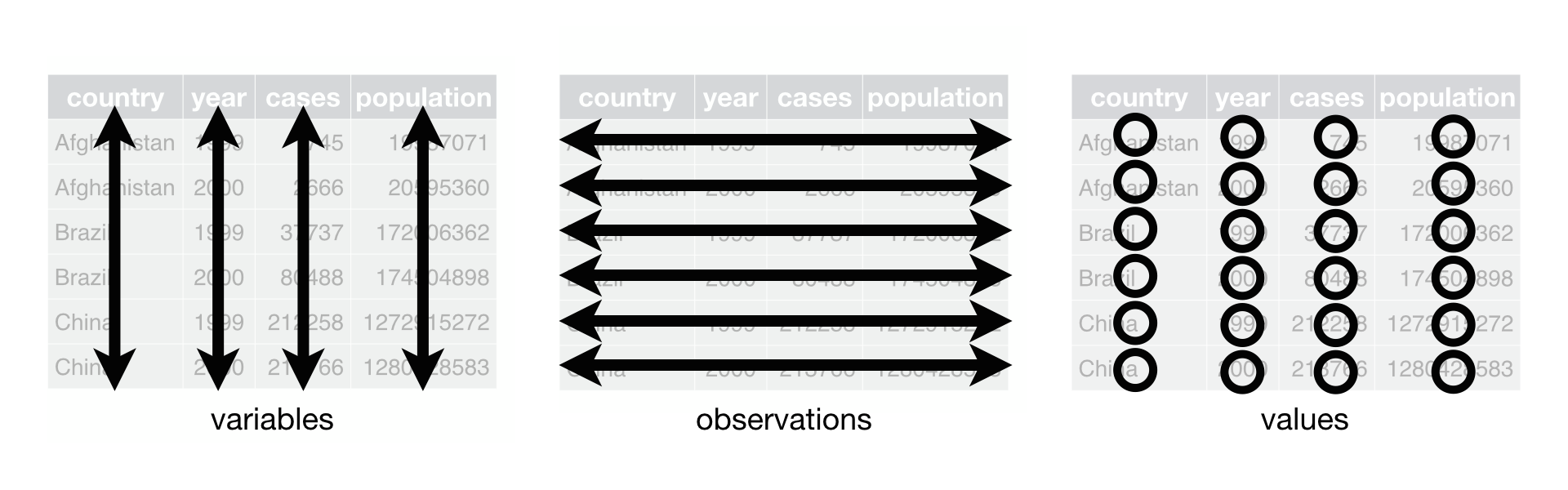
Image 1 of 1: ‘датафрейм розміром 3 на 3 зі стовпцями, що містять числові, текстові та логічні значення.’
Figure 2
Image 1 of 1: ‘Monsters at a fork in the road, with signs saying here, and not here. One direction, not here, leads to a scary dark forest with spiders and absolute filepaths, while the other leads to a sunny, green meadow, and a city below a rainbow and a world free of absolute filepaths. Art by Allison Horst’
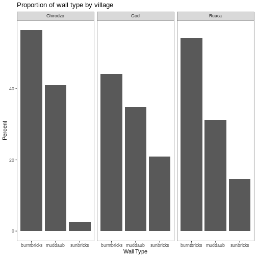
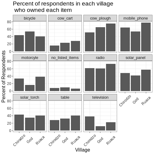
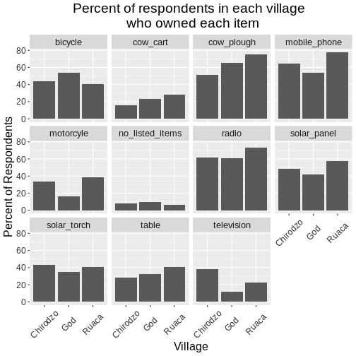
Розташування даних у
довгому та широкому форматах головним чином впливає на зручність
перегляду. Візуально вам може більше подобатися “широкий” формат,
оскільки на екрані можна побачити більше даних. Проте всі функції R, які
ми використовували досі, очікують, що дані будуть у “довгому” форматі.
Це пояснюється тим, що довгий формат легше сприймається машиною і
ближчий до формату баз даних.
Figure 3
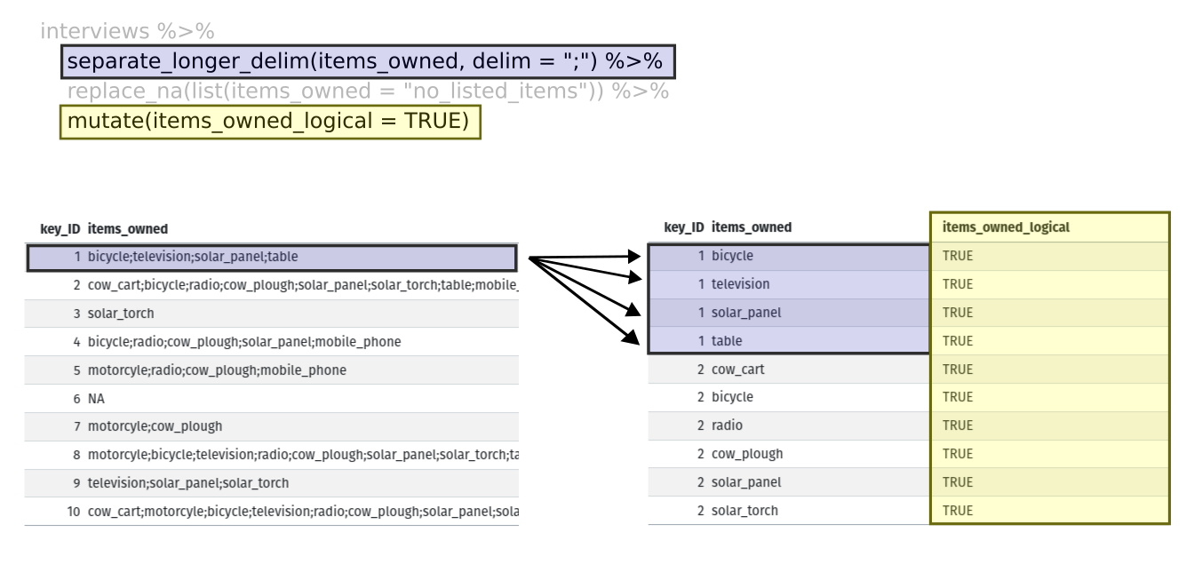
Image 1 of 1: ‘Дві таблиці, показані поруч. Перший рядок лівої таблиці виділено синім, а перші чотири рядки правої таблиці також виділено синім, щоб показати, як кожне значення з 'items owned' отримало окремий рядок за допомогою функції separate_longer_delim(). Стовпець 'items owned logical' виділено жовтим у правій таблиці, щоб показати, як функція mutate додає новий стовпець.’
Figure 4
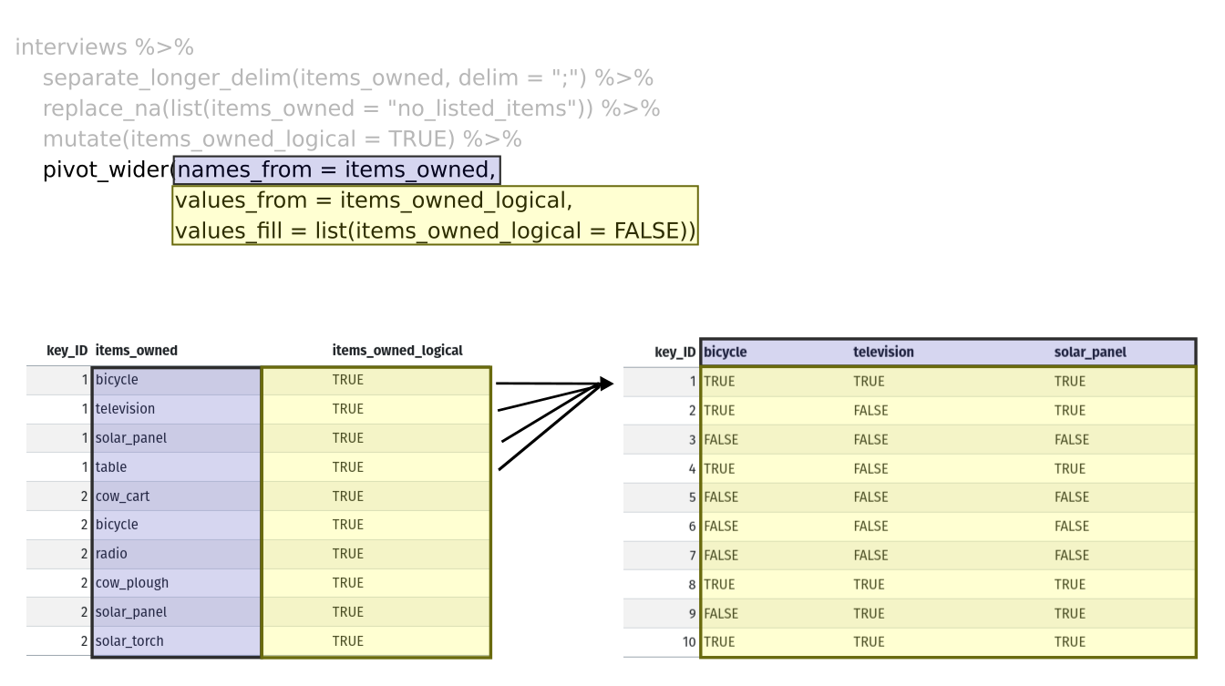
Image 1 of 1: ‘Дві таблиці, показані поруч. Стовпець 'items owned' виділено синім у лівій таблиці, а назви стовпців виділено синім у правій таблиці, щоб показати, як значення зі стовпця 'items owned' стають назвами стовпців у результаті функції pivot_wider. Стовпець 'items owned logical' виділено жовтим у лівій таблиці, а значення стовпців bicycle, television і solar panel виділено жовтим у правій таблиці, щоб показати, як значення стовпця 'items owned logical' стали значеннями цих трьох стовпців.’


 R for Data Science,
Wickham H and Grolemund G (https://r4ds.had.co.nz/index.html)
© Wickham, Grolemund 2017 This image is licenced under
Attribution-NonCommercial-NoDerivs 3.0 United States (CC-BY-NC-ND 3.0
US)
R for Data Science,
Wickham H and Grolemund G (https://r4ds.had.co.nz/index.html)
© Wickham, Grolemund 2017 This image is licenced under
Attribution-NonCommercial-NoDerivs 3.0 United States (CC-BY-NC-ND 3.0
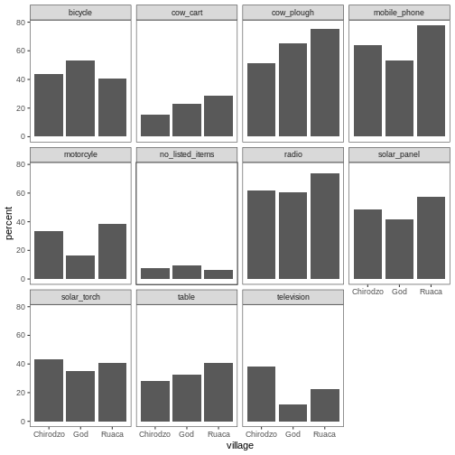
US)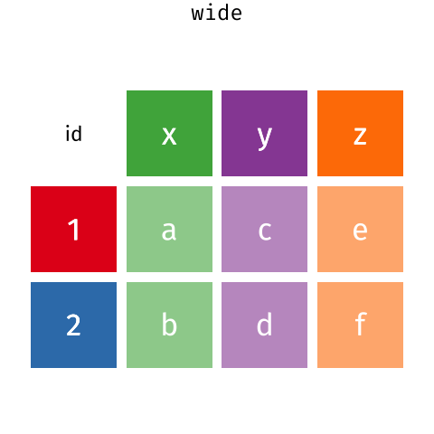 Розташування даних у
довгому та широкому форматах головним чином впливає на зручність
перегляду. Візуально вам може більше подобатися “широкий” формат,
оскільки на екрані можна побачити більше даних. Проте всі функції R, які
ми використовували досі, очікують, що дані будуть у “довгому” форматі.
Це пояснюється тим, що довгий формат легше сприймається машиною і
ближчий до формату баз даних.
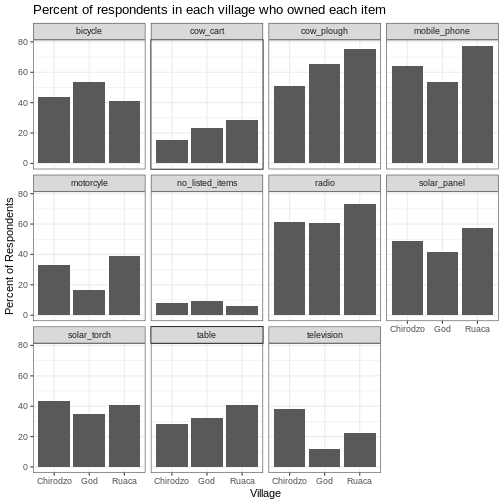
Розташування даних у
довгому та широкому форматах головним чином впливає на зручність
перегляду. Візуально вам може більше подобатися “широкий” формат,
оскільки на екрані можна побачити більше даних. Проте всі функції R, які
ми використовували досі, очікують, що дані будуть у “довгому” форматі.
Це пояснюється тим, що довгий формат легше сприймається машиною і
ближчий до формату баз даних.